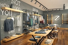
When setting up a store, it is so important to get the layout right. If the layout and style of your store does not flow correctly, then people will not want to visit, and if they do visit, they will spend a small amount of time in your store before leaving, most likely not making a purchase. Here are some top tips for creating a store layout that will attract customers.
Color
What the color of your store says also highlights what type of brand you are trying to create and mold. For example, white is more clinical, pink is associated as more feminine, and black is seen as more masculine. Although you may not think the colors that you use in your store on the walls will have much impact on your customers – they will. So, spend some time putting together a mood board of how you want your store to look. What colors you want to incorporate and why. Putting a mood board together will allow you to quickly and clearly see your vision come to reality, and to change things before it is too late.
Clutter
Customers want to see what you have for sale instantly; they don’t want to be rummaging through the stock to find what they want. So ditch the ornaments, old stock, and accessories and keep it simple. Make it quick and easy for customers to navigate your store, and for customers to see what you have for sale. Don’t have anything in your store that is not for sale as this will simply confuse customers.
Fixtures
The fixtures and fittings you use in your store reflect what you are about and what you represent as a brand. If you use cheap and cheerful fixtures, you will be sending this message to your customers. Get top quality fixtures and fittings that are appropriate to your store from places like the Retail Factory that provide Sports Mannequins. Don’t scrimp and save in the fixtures as they are an extension to the image you are trying to convey to customers.
Lighting
How bright or dark a store is will determine how long customers want to stay. Use feature lighting to make a statement and to highlight new trends and key pieces within your store. Dark, poorly lit stores may be cheaper to run, but they will not get customers through the door. So when creating your ideal layout, don’t forget to focus on the lighting.
Space
Even if your store is not the biggest space on offer, you still have to create the illusion of space. Don’t try and cram lots of things in your store; try to use the space as cleverly and effectively as you can. Utilize floor space but keep aisles and walkways clear, always ensure customers can move freely around your store without bumping into any fixtures or fittings.
When designing a store layout, think about your favorite stores, how are they set out, what do you enjoy about your experience when you visit those stores? Using other stores as an influence is a great starting out point.


