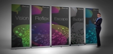
In order to have an effective, eye-catching roller banner to display at your next event you need to design artwork for the banner that makes people take notice. Putting together a stand-out banner can be a daunting prospect if you do not have any design experience, but fortunately it is not actually difficult to make something interesting and creative for your stand. Here are some tips for designing a great roller banner, and how to create something that will be remembered for all the right reasons.
Remember to Keep it Simple
No matter how relevant and interesting you think your banner is, the fact remains that people will not spend much time looking at it. That’s not because it’s not a good banner, but because banners are usually designed for displaying in a high-traffic location where people pass by, such as an exhibition or in a busy store. The display stand should have only the most relevant information, simple graphics, your logo, and minimal text.
Don’t Forget about Resolution
When you are designing roller banners with the help of a specialist printing firm they will advise you what resolution you need the images to be supplied in. But it is important to remember that you can only use high-resolution images, which means you can’t take images from your website. Take photos with a high-resolution digital camera or use images from a photo library – but remember you will probably have to pay for the higher quality images.
Design Something Specific for your Customer
Think about your target audience and what they want to know or to find out. Answer their questions, provide information relevant to their needs, and design a banner that makes a difference to them. The design you use will be determined by factors such as customers’ age, interests, spending power, etc. If you want different designs for different audiences or occasions you can find roller banners that are interchangeable with different graphics.
Keep it Colourful
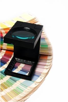
But don’t use the wrong colours. Make sure colour sets the right tone for your business and creates the right image in terms of marketing message. The use of different colours has a range of effects on people who see your display, so consider what you want to tell people and how you want to make them feel.
Stay Within the Brand
Even if your company is relatively small you should still have some design principles that you follow in all your marketing material such as your company colours, logo, style of font, etc. It makes you look more professional and organised if your marketing material is cohesive.
Always Add Your Details
Don’t forget to include your contact information or otherwise people will not know how to get in touch. It is easy to add your Facebook and Twitter details too – many people will be on their Smartphone at events and will quickly be able to navigate to your pages. If you are unsure how big to make the text, or where to display it, you can always hire the banner manufacturer to do the design work for you. Many companies offer this service.
Image courtesy of posterize/ FreeDigitalPhotos.net


actually design for display in high-traffic spot perfect roller banner show contest. when many people traffic jam then they are saw the roller banner display but its cost highly.Its so helpful content……